09 Feb ANZAC DAY
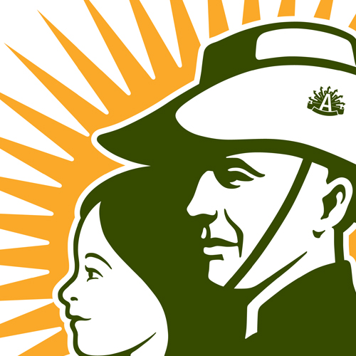
a young girl and a “digger” to symbolise the significance of the event for all ages....

a young girl and a “digger” to symbolise the significance of the event for all ages....
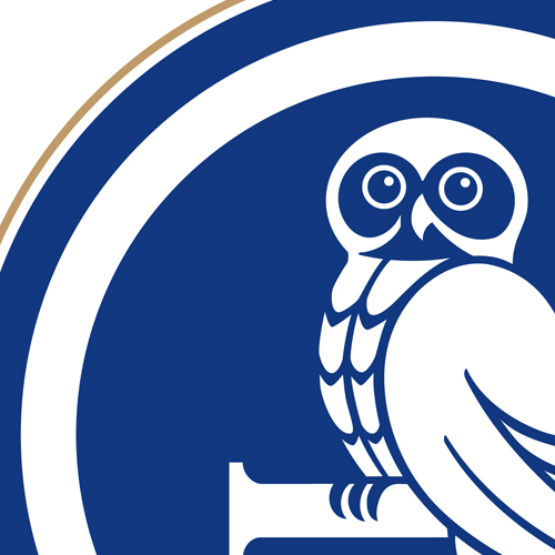
A family business which had gone through generational change required a new look. Taking the lead from our owl-loving client, we created the G monogram complete with owl. The new image was applied to website, signage and stationery....

This monogram device was created for a Melbourne-based specialist in handmade guitars....
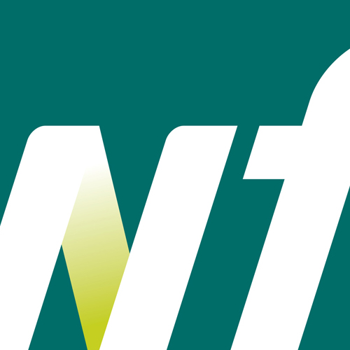
WFI represents the insurance arm of Wesfarmers....
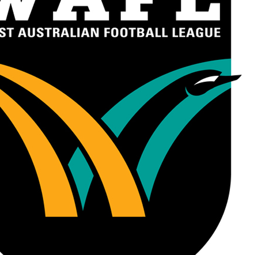
The WAFL needed to create a new image for the organisation which was contemporary and dynamic...
the promotional logo would become the public face of the institution on signage, advertising and publications....

Captures the wider environment from the scarp to the foothills....
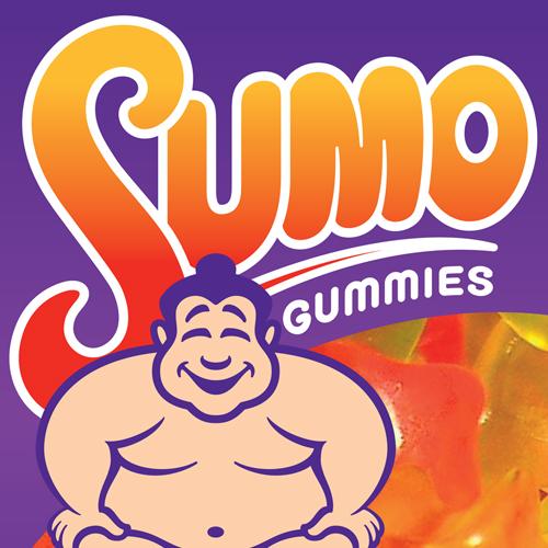
Sumo wrestling is very popular in Mongolia....
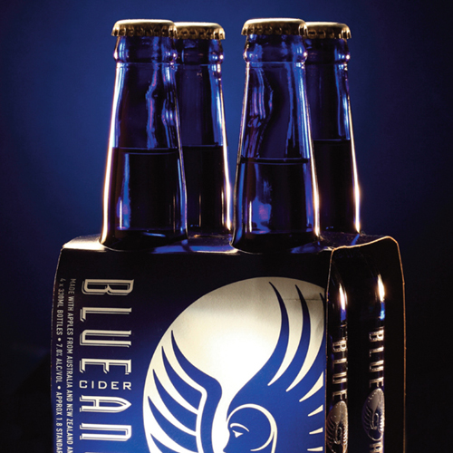
Gage Roads Brewing decided to release a Cider which catered particularly to the 18 to 30 year old female market. We created the Angel icon and a unique proprietary lettering style which carried through to all applications....
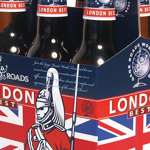
Images were created for English, German, American and Irish styles....